
Colour Coordination Without a Degree in Colour Theory
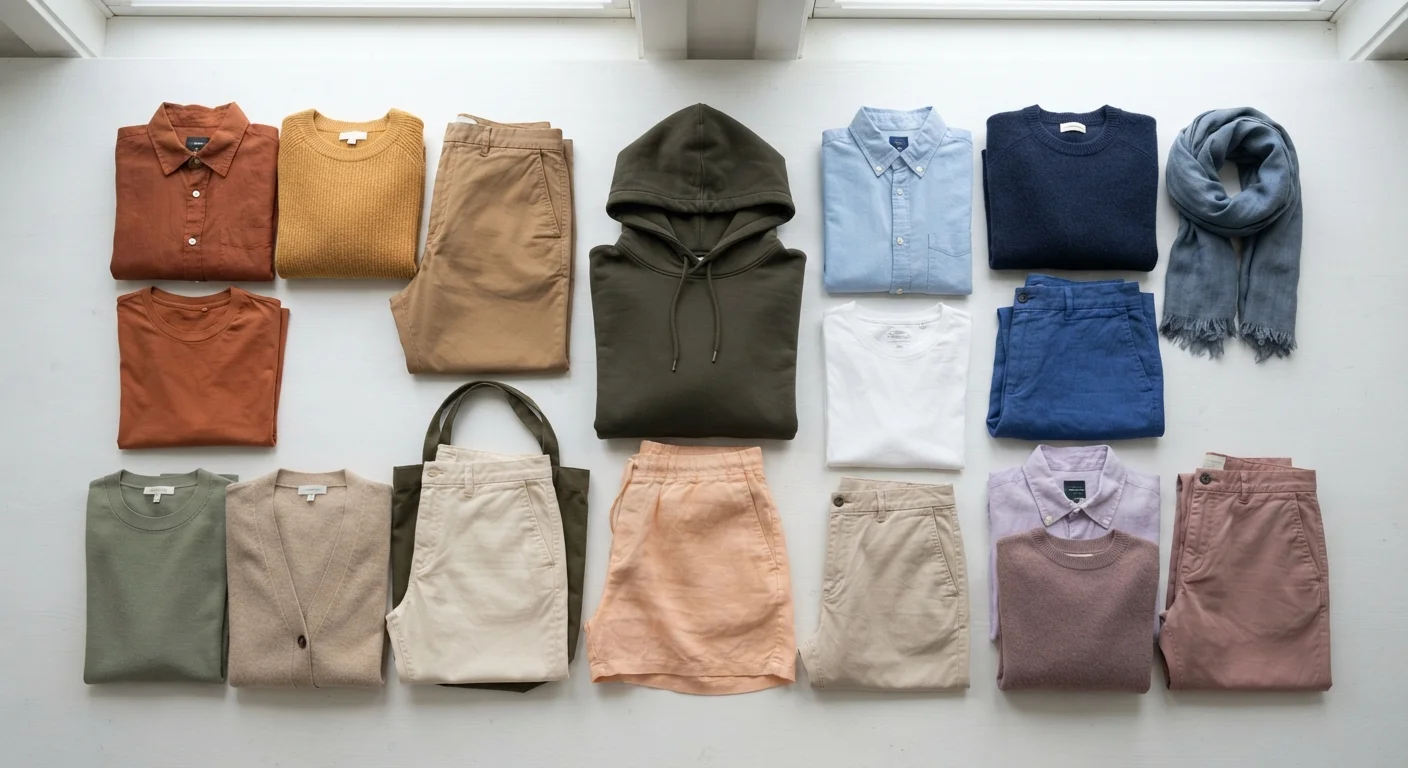
Photo credit: FindersGroove.com | Discover Important Information
In this article
You don't need formal training to put colours together confidently. A practical introduction to how colours interact and the simple rules that make combinations work.
Key Takeaways
- Three simple colour relationships - analogous, complementary, and neutral-anchor - cover the vast majority of great outfits.
- Tone and saturation matter as much as the colour itself; matching these creates visual harmony.
- A small, intentional palette of five to seven colours makes daily outfit decisions far easier.
- You don't need to follow rigid rules - understanding why combinations work lets you break them purposefully.
- Neutrals act as flexible bridges that make almost any colour pairing look intentional.
Why Colour Feels Complicated (And Why It Isn't)
Colour theory sounds intimidating - the kind of thing studied under studio lights with a pantone fan. But the principles that actually govern everyday outfit choices are far simpler than what's taught in design school. Most of what makes a colour combination look pulled-together comes down to a handful of relationships, not a full curriculum.
The real reason colour feels hard is that most of us learned by accident: copying outfits we saw, avoiding colours that got a bad reaction once, and defaulting to black because it's safe. That approach works, but it leaves you locked out of a huge range of options. Understanding even the basics unlocks genuine creative freedom - and makes building a cohesive personal style significantly easier.
Colour wheel
A circular diagram showing how colours relate to each other - from primary colours (red, yellow, blue) through the mixtures between them. It's the map designers and artists use to understand colour relationships.
Analogous colours
Colours that appear next to each other on the colour wheel and share a visual similarity. They create harmonious, low-contrast combinations that feel natural and easy on the eye.
Complementary colours
Colours positioned directly opposite each other on the colour wheel. When paired, they create strong visual contrast and can make each other appear more vivid.
Saturation
How vivid or intense a colour appears. A highly saturated colour looks bold and bright; a desaturated colour looks muted, washed out, or dusty.
Tone
How light or dark a colour is, independent of which colour family it belongs to. Two very different colours can share a similar tone and therefore sit comfortably together.
Neutral
A colour with very low saturation that pairs easily with most other colours - including white, black, grey, camel, navy, and cream. Neutrals act as visual anchors in an outfit.
The Three Relationships That Do Most of the Work
Forget memorising the full colour wheel. These three relationships handle the vast majority of successful outfit combinations:
- Analogous: Colours that sit adjacent on the colour wheel - think olive, forest green, and teal. They share enough in common to feel harmonious without being matchy. This is the easiest relationship to work with and rarely goes wrong.
- Complementary: Colours directly opposite each other - like blue and orange, or purple and yellow. These create high visual contrast and energy. Done well, they're striking. Done carelessly, they fight. The secret is usually moderating the saturation of at least one.
- Neutral-anchor: Pairing one expressive colour with one or two low-saturation neutrals. This isn't really a colour wheel concept - it's just the most practical wardrobe reality. A camel coat over a cobalt blue knit works because the neutral gives the eye somewhere to rest.
If you can identify which of these three relationships you're working with before getting dressed, you're already ahead of most people.
Try the Phone Camera Test
Before you head out, take a quick photo of your outfit in natural light. Seeing it as a flat image rather than on your body helps you spot tonal mismatches and colour imbalances much more easily. It's a simple habit that professional stylists use regularly on set.
Tone and Saturation: The Hidden Variables
Here's where a lot of beginner colour frustration comes from: two pieces that should theoretically work together look off. Usually the culprit isn't the colours themselves - it's a mismatch in tone or saturation.
Saturation is how vivid or muted a colour appears. A bright cherry red and a washed-out dusty rose are both red, but they don't share the same visual energy. Mixing a highly saturated piece with a very muted one often feels jarring. Keeping both pieces at a similar saturation level creates harmony even if the colours are very different.
Tone refers to how light or dark a colour is. Outfits with similar tonal values - all light, all mid-range, or all deep - tend to feel intentional. Mixing a pale blush with deep burgundy works because it's a deliberate contrast; mixing five different mid-tones from incompatible colour families just reads as muddled.
Warm vs. Cool Undertones in Neutrals
Not all neutrals are interchangeable. White comes in warm (cream-toned) and cool (blue-toned) varieties; beige can skew yellow or pink. Mixing neutrals with mismatched undertones - like a warm camel with a cool grey - occasionally creates a subtle tension that's hard to name but easy to feel. This isn't a strict rule to memorise, just something worth noticing as your colour eye develops.
Practical Rules for Getting Dressed With Confidence
Rules are only useful when you understand the reason behind them. Here are a few that reliably work - and why:
- Use the 60-30-10 proportion guide loosely: Roughly 60% of your outfit in a dominant colour or neutral, 30% in a secondary, 10% in an accent. This isn't a law, but it explains why an outfit with too many equal-weighted colours feels overwhelming.
- Let patterns anchor your palette: If you're wearing a printed piece, pull one colour from it into a solid elsewhere in the outfit. The pattern already did the coordination work - you just need to echo it.
- When in doubt, match the temperature: Warm colours (reds, oranges, yellows, warm browns) and cool colours (blues, greens, purples, grey-toned neutrals) tend to sit more comfortably together within their own temperature family. Mixing warm and cool tones can absolutely work, but it takes more intentionality.
For a deeper dive into how colour choices interact with your broader wardrobe strategy, exploring the neutral vs. colour-driven wardrobe debate is a worthwhile next step.
Building Your Own Workable Palette
The most practical thing you can do with colour knowledge is translate it into a small personal palette - a set of five to seven colours that all work together, making every combination you reach for in the morning a valid one. This is the foundation of a wardrobe colour palette that actually works for you.
Start by identifying two or three neutrals you gravitate toward naturally. Then add two expressive colours that relate to each other - ideally analogous or connected by tone. Finally, choose one wildcard accent that creates contrast. When your wardrobe is built around this palette, coordination becomes almost automatic.
Colour confidence isn't about knowing every rule - it's about understanding enough to make deliberate choices. Carrying that visual consistency across different occasions is the natural next challenge once your palette feels solid. Start small, trust your instincts, and remember that even professional stylists work from a handful of go-to combinations - not an infinite matrix of possibilities.
Frequently Asked Questions

Author
Style & Beauty Editorial Team
Style & Beauty Editorial Team is the collective byline for our editorial team and contributor network. Articles published under this byline or an editorial pen name are researched, written, and reviewed according to our editorial standards for clarity, consistency, and independence before publication.
View all articles →