
Dark Patterns: The Design Tricks That Make You Spend More
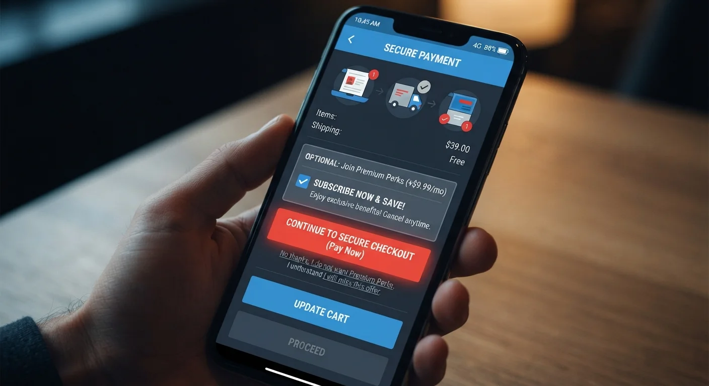
Photo credit: FindersGroove.com | Discover Important Information
In this article
From hidden opt-outs to confusing cancellation flows, dark patterns are built into many apps and websites. Learn to spot them.
Key Takeaways
- Dark patterns are intentional design choices built to benefit businesses at users' expense.
- Common types include hidden opt-outs, confusing cancellation flows, and pre-checked add-ons.
- Awareness is your primary defense - slowing down before clicking reduces their effectiveness.
- Regulators are beginning to act, but self-protection remains essential for now.
- Dark patterns often work alongside psychological triggers like urgency and social proof.
What Dark Patterns Actually Look Like
Dark patterns aren't accidental bad design. They are deliberate, often expensive to build, and tested extensively to maximize conversions - usually at the user's expense. Understanding the most common types makes them far easier to catch in the wild.
Confirmshaming presents opt-out buttons with guilt-laden language, like "No thanks, I prefer to overpay" instead of a neutral "No thanks." The goal is to make declining feel socially or emotionally uncomfortable.
Hidden subscription enrollment buries a recurring billing agreement inside a one-time purchase flow. A user thinks they're buying a single item; they've actually agreed to a monthly charge. This type overlaps with what regulators call "negative option marketing."
Pre-checked boxes automatically add items - insurance, donations, extended warranties, newsletter subscriptions - to a cart or form. Users who don't read carefully proceed without realizing they've opted in.
Roach motel flows make signing up trivially easy but canceling deliberately painful - burying cancellation inside nested menus or requiring a phone call during limited hours.
Misdirection uses visual hierarchy to draw attention to one option (often the more expensive one) while making the alternative technically available but visually suppressed.
Dark Patterns and Psychological Triggers Often Work Together
Dark patterns rarely operate in isolation. They're most effective when combined with urgency cues (countdown timers, low-stock warnings) and social proof ("thousands of people bought this today"). Recognizing the full environment - not just the interface element - gives you a more complete picture of when you're being nudged. For more on these broader tactics, see shopping pitfalls that catch careful buyers off guard.
These patterns often appear alongside psychological pressure tactics like countdown timers and low-stock warnings. For a deeper look at those techniques, see how scarcity and social proof nudge spending.
Why They Work - and Who's Vulnerable
Dark patterns succeed because they exploit the way human brains actually process information under real-world conditions: quickly, under mild distraction, trusting familiar visual conventions. Nobody reads every word of a checkout flow. Interfaces are designed with that knowledge baked in.
76%
Online shoppers who missed a pre-checked add-on
A Princeton and University of Chicago study analyzing 11,000 shopping sites found that a majority of users didn't notice pre-selected items added to their carts during checkout flows.
29
Distinct dark pattern types catalogued by researchers
A 2022 systematic review published in academic literature on dark patterns identified nearly 30 distinct manipulative design techniques across digital commerce platforms.
$8.3B
Annual US consumer spending on unwanted subscriptions
Survey research from financial services firms has consistently estimated that American consumers collectively spend billions annually on subscriptions they either forgot about or didn't intentionally sign up for.
These tactics are especially effective during high-motivation moments - a time-limited sale, the final step of a long checkout, or a free-trial signup where you just want to get access. The further along a process you are, the more likely you are to accept friction rather than abandon the transaction.
The psychological mechanisms that make dark patterns effective are closely related to the cognitive biases discussed in the psychology behind overspending. Default bias - the tendency to accept whatever is pre-selected - is one of the most heavily exploited.
Younger users are not automatically more resistant. Familiarity with digital interfaces can create overconfidence, leading to faster, less-careful clicking rather than more scrutiny.
How to Protect Yourself at the Point of Decision
Awareness is the most durable defense, but it needs to translate into specific habits at the moments that count.
- Pause before the final click. Slow down on any screen with a payment button. Scan the full page - including smaller text and pre-selected checkboxes - before confirming.
- Be skeptical of any "free" offer. Free trials almost universally require payment information and auto-renew. Set a calendar reminder for the trial end date the moment you sign up.
- Navigate cancellation before you subscribe. If you can't easily find the cancellation path for a service before signing up, treat that as a signal about how they'll treat you as a customer.
- Check your cart at every stage. Items and add-ons can appear mid-flow. Review your itemized total, not just the final number, before paying.
- Screenshot confirmations. If you've deliberately opted out of something, capture evidence in case a dispute arises later.
Dark patterns also contribute to the broader problem of costs that accumulate invisibly. The hidden costs inflating what you actually spend often trace directly back to subscription traps and auto-enrolled add-ons enabled by this kind of design.
Before You Subscribe: A 60-Second Check
Before completing any free trial or subscription sign-up, open a separate tab and search "[company name] cancel subscription." If the process is buried, requires a phone call, or has widespread complaints, you've learned something important before handing over your payment details. This single habit can save significant time and money.
The Regulatory Landscape and What It Means for You
Enforcement is moving, but unevenly. The Federal Trade Commission has issued guidance and taken action against companies using deceptive subscription enrollment and cancellation barriers. The EU's Digital Services Act and GDPR explicitly identify certain dark patterns as non-compliant with informed consent requirements. Several US states - including California - have enacted specific rules around automatic renewal disclosures.
For consumers, this matters in two practical ways. First, if you've been enrolled in a subscription without clear consent, you may have grounds to dispute charges with your card issuer or file a complaint with the FTC at reportfraud.ftc.gov. Second, regulatory pressure is creating some incentive for companies to clean up their interfaces - though self-interest still pulls the other direction.
Staying informed about how platforms collect and use your data is a related layer of protection. Understanding how personalised advertising works helps you recognize when design choices are informed by detailed behavioral profiles built specifically to target your weak points.
Until regulatory frameworks catch up comprehensively, the practical burden remains on consumers to stay alert. The tools above - slowing down, checking defaults, documenting opt-outs - remain your most reliable protection.
Frequently Asked Questions

Author
Smart Shopping Editorial Team
Smart Shopping Editorial Team is the collective byline for our editorial team and contributor network. Articles published under this byline or an editorial pen name are researched, written, and reviewed according to our editorial standards for clarity, consistency, and independence before publication.
View all articles →